Main Menu

The Stuff That Résumés Are Made Of

I’d recently been admiring some examples of graphic résumés, but couldn’t imagine how I could ever do one. Turns out Articulate’s resident nudger, David Anderson, keeps an eye out for that sort of thing and his challenge this week is to come up with an interactive résumé or portfolio. So time for me to figure it out.

I haven’t had much call for a résumé since I’ve been independent, but creating an interactive graphic where I could play with the idea of a résumé sounded like fun, so off I went.

Main Menu

Click Image for Demo

Inspiration

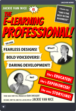
My friend and talented freelance e-learning designer Donna Carson gave me edits for a bio I submitted with my DevLearn speaking proposals on Friday. The phrases she used made me want to both laugh and go conquer the world at the same time. Her description of my “fearless flair” in designing training inspired me to come up with “Fearless Designs!” “Bold Voiceovers!” and “Daring Development!” to describe what I do.

For graphic inspiration I turned to old movie posters. They had the expressive graphics and cool details I wanted, plus they could handle the dramatic phrases I had in mind.

Charlie Chan Movie

My Graphic Inspiration

Design

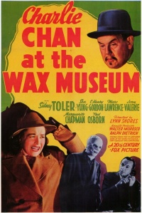
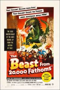
Graphics: To start, I pinned old movie posters I liked and chose a color scheme that resonated with me. You can clearly see I used the colors and rough layout of the Charlie Chan at the Wax Museum poster. For text callouts and credits I used elements based on other posters including The Beast From 20,000 Fathoms.

Theme: I chose a detective theme because I was drawn to the idea of Humphrey Bogart’s Sam Spade. He’s on the right side of the law, but still seems a little shady. (His line that the Maltese Falcon is “the stuff that dreams are made of” inspired this post’s title.)

The Beast From 20,000 Fathoms

More Graphic Inspiration

The Theater: I wanted an entry screen so that, once clicked, the user’s full attention is on the initial visuals, music, and animation when they hit the main screen – and having them click a ticket to get inside made sense.

The way the overall flow works is based on the little theater I practically lived at as an undergrad at Humboldt State University in Arcata, California. The Minor, off the little town square, was an old art house movie theater that changed its double or triple features at least three times a week. I spent a few thousand of the happiest hours I’ve ever spent in my life there, and got to see a gabillion classic movies like the ones that inspired this piece.
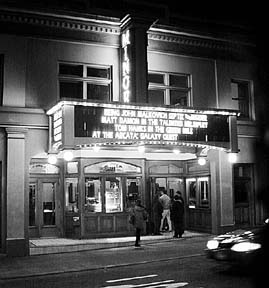
The Minor Theater

The Minor Theater

When it was cold out, you’d come off the street through a thick red curtain, get popcorn and admire the old movie posters in the lobby, then go through another red curtain to enter the theater. So I was seeing my résumé as one of those old posters in the lobby.

Audio: I wanted to bring it to life with sound. There are effects for audience buzz, curtains being pulled aside, cheers, applause, police whistles, sirens, screams, breaking glass, etc., but I wanted a theme song. The whole time I was working on this I kept hearing a driving theme somewhere between Peter Gunn and James Bond. Lucky for me I’ve got an “in” with talented songwriter, musician, and freelance e-learning guy Dan Sweigert who was able to write and produce the theme song in no time flat.

Content

EducationRésumé Elements: I kept it simple and included my (boldly-phrased) skill set, education, experience, and the main software I use. The sections for education and experience were by far the biggest creative challenges, but in the end I was happy to find a quick way to blow through them that still maintains the tone and theme.

Brevity: I find it endlessly entertaining that each of the links from the main screen shows just one screen of content (at best) that makes the audience go wild. I wanted to get in, show a glimpse of just a morsel of my work, and get out. The full versions of each piece are in my online portfolio, and the link to it is in the player tab at the top.

External Links: I renamed the player’s “Resources” tab to “UNCOVER MORE!” and had fun coming up with suspicious-sounding titles for the links to my blog, online portfolio, LinkedIn profile, and Twitter account. They make me laugh every time.

See It In Action!

Enjoy the vintage-inspired goodness right here.


My Sketchy Life as an E-Learning Designer

Since so many people are sketchy about what we do as e-learning designers, it seems appropriate to answer this week’s Articulate challenge in a similar vein.

This week’s challenge is to answer the question “What do e-learning designers really do?” using the architecture of a visual meme supplied by David Anderson.

Design

My Sketchy Life as an E-Learning Designer

Click for Larger Image

I considered doing something interactive in Storyline, but went for a simple image instead. I’ve been playing with sketches lately and it seemed like a good sketching exercise. I created the finished image in PowerPoint.

Sketches: I made these on an iPad with an app called Pencilicious and a generic cell phone stylus. It would have been hugely easier with a stylus that wasn’t shaped like a big fat pencil eraser, but they don’t call this a “challenge” for nothing.

My process to go from scribbling to having usable PNG files: Sketch on iPad > email to self as PDF > export images as PNGs > use ’em! I was impressed with Pencilicious. It was the simple, easy-to-use app I was hoping for at only $2.99, and I’m looking forward to using it more.

Colors: I tamed the all-black frame of David’s example to more of a graphite color to work with the pencil-like theme. The only other colors are in the carrot garden, and that was because I didn’t think my carrots would look like carrots without color. I tried balancing that color with color elsewhere, but didn’t like it. So it’s an unbalanced design in favor of my bunny’s carrots.

Fonts: I’ve been in love with the header font, Cabin Sketch, since we first met. I’ve not had a chance to use it until now, so color me happy. The caption font is Cabin (brother of Cabin Sketch), and the three fonts in the first frame are Cedarville Cursive, Chocolate Windows, and Sneakerhead BTN Shadow.

Content

What my family thinks I do. This is dead accurate. My sister-in-law just sent me a job post, happily noting that it sounds “just like you!” It was for a publishing job. My brother suspects I do something with computers, and my lovely mother excitedly tells everyone she can that I’m an extraordinary businesswoman. (She’s sweet like that.)

What my family thinks I do.

What my rabbit thinks I do. All she knows is that I come up with endless feasts of carrots and kale, and she knows you get carrots by digging them up, so she probably thinks this is what I’m up to all day.

What my neighbors think I do. There’s no way they’d even have a guess. Best case, they think I spend all my time goofing off between vacations.

What my clients think I do.
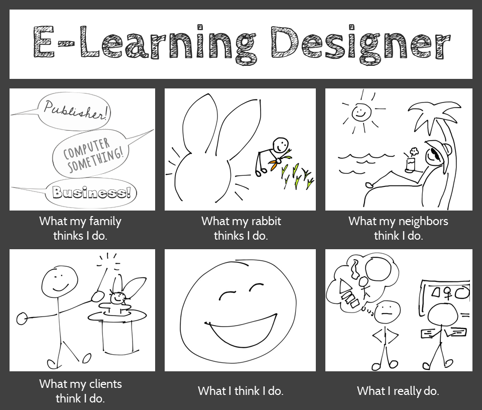
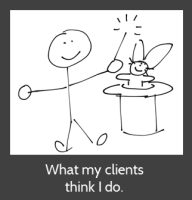
What my clients think I do. I adore them because they think I make magic happen.

What I think I do. I love what I do as an e-learning designer (don’t tell anyone), and between that and getting to work for myself from home, it’s hard not to be happy.

What I really do. I do what we all do: I work with clients; take in a gazillion project details; organize, analyze, and process them; dream up attractive, effective, and fun training solutions; and build them. (In a computer! So my brother was right.)

Hope you like it!

The Beginning of the End

Let’s Start at the End (Of Your Course)

This week’s Articulate E-Learning Heroes challenge is to send a little love to the end of your course. It can be lonely and confusing back there – (“Is it over?” “What am I supposed to do?”) – so this week we’re sending back a life line.

The Beginning of the End

The Beginning of the End

Context & Theme

I wanted to indicate we’re starting at the very end of an interminably long course. My first choice was to start at the end of pi, but finding the end of pi is even more nebulous than the end of most courses, so that was out. (Maybe when I see Neil DeGrasse Tyson at DevLearn in October I’ll ask him if he’s made any progress on that Pi issue.)

So instead I created (the end of) a course called “Enough Already! 5,000 Little-Known Animal Facts”, which starts on the last part of the last fact about the last animal.

Indicating Completion and Next Steps

Indicating Completion and Next Steps

Spelling it Out

To be clear that you’ve reached the end of the course, I start with a congrats slide that also indicates you have a little more to do before you go.

Final Decisions

Final Decisions

Final Decisions

Which leads to an animal-themed screen where you get to make decisions.

Hover State Visual: Hovering over each picture reveals where you’ll go if you click on it.

Hover State Audio: Hovering also reveals a bit of audio. Its purpose is to add a touch of interest, amusement, and wake you up – but there have been reports of startled coworkers and kitties as of late, so consider yourself warned.

Gate Screen for Feedback

Gate Screen for Feedback

Gate Screens

After you make a selection you’ll go to a gate screen to confirm your choice.

David Anderson had a gate screen challenge a few months ago where he talked about them, and you can also see the different examples created by members of the community.

Placeholder for Feedback

Placeholder for Feedback

Room for More

In this example, if you choose anything other than “Exit” you’re taken to placeholder slides that could harbor summarizing thoughts, more resources, ideas for review, or a means of leaving feedback.

See it in Action!

Take a look at this wild little ending right here.


What Do I Think of Storyline? Well, Since You Asked…

This week’s E-Learning Heroes Challenge is to come up with a “Top 10” list of things you’d tell someone about Storyline. You can collect your favorite resource links and curate them any way you’d like.

I basically took everything that I normally say to someone who asks me about Storyline, put it all together with appropriate links, and tied a bow on it. (Not unlike last week’s challenge where I did the same for what I tell future freelancers.)

Opening Screen

Opening Screen

The Design

One advantage of the gallery layout on my blog is that I can instantly see what sort of design I should do to contrast with my recent work. Since my last two entries haven’t had vibrant color palettes, and since spring is officially here, I went for bright and springy with a little bit of silliness and a little bit of elegance.

I also didn’t want a main menu with squares or buttons that linked to the 10 points. I wanted the menu to be a creative, vibrant, graphic embodiment of the theme. Once I made that decision, the idea for the springing-up flowers came easily.

Main Menu

Main Menu

Main Menu Flowers: I wanted flower shapes that I could fill with photo captures from their related content pages. So I took out my trusty Wacom tablet and started drawing the basic outlines of the flowers, stems, and leaves. I did it in Storyline by going to Insert > Shape > Lines > Scribble and drew them right on the slide.

Then I adjusted the outline weight and color and did a picture background fill for each shape using a tight capture from each of the larger flower photos.

To make the flowers pop in their hover states, I increased the weight of the flower’s outline by a pixel or two, and increased the size of each flower by about 4 pixels in width and height.

Audio: The sound effects for the flowers are two different sounds on top of each other. One’s a pop and one’s a spring. The singing birds are a piece of audio that I looped. I knew it was possible, but had never done it before. A quick Google search took me to this simple how-to. (Thanks, David!)

Content Page #2

Content Page #2

Content Page Colors: To get colors for my text, fills, and outlines that went perfectly with the flower images, I used the heck out of the eyedropper tool.

Content Page #5

Content Page #5

Photos: They’re all from Microsoft Clipart. I wanted big, clean, bold, colorful images.

Fonts: I’ve used the title font, Blue Chucks, a couple of times lately. Same with the paragraph font Copse. When you’re a cute font, you’re gonna get used.

Content Page #9

Content Page #9

The Content

It is what it is! This is what I tell people who ask, and these are the resources I direct them to.

The Finished Product

You can see it in all of its springy loveliness right here. Enjoy!


This is Why Freelancers Need Floaties

This week’s Articulate E-Learning Heroes Challenge is to create a photo collage that tells a story.

I’ve just gotten home from a (great!) week at the E-Learning Guild’s Learning Solutions Conference in Orlando, and the theme that kept coming up was freelancing. Not just in sessions, but in countless random conversations, and I found myself offering a lot of advice to hopeful freelancers.

I Smell a Theme

So because there’s only so much space in my head and this is the topic currently on tap in there, my photo collage story this week is about a guy who wants to freelance. The points I’ve included are a summary I quickly put together for this piece, but it’s similar to what I was sharing all week.

The StoryThe Story

If I’m going to tell a story, I need a starting point. So I overlaid our (miserable) hero on top of the rest of the photo collage so that I could establish his yearning-to-go-freelance motivation. The underlying photos and their content, each of which reveals a portion of our hero’s journey, can be visited in any order. And of course you get to see the result of his efforts at the end.

Visual DesignVisual Design

I kept the visual design pretty simple. The photos are framed in a pseudo-Polaroid fashion. The caption font on the top photo is Dawning of a New Day. The title font on the pop-ups is Swiss921 BT, and the main pop-up font is Candy Round BTN Condensed.

I reused a beach and palm tree from a recent post about freelancing, mostly because I wanted the tree for the end scene.

And I reused poor Ian again. I’ve forced that poor man into service as an airline pilot and a beer-guzzling traveler in recent weeks and wanted to give him a rest, but I needed someone who could fit into the outfit at the end, and he had the perfect figure. (Sorry, guy.)

Storyline DesignStoryline Design

When clicked, each photo in the collage pops up on a slide layer with more info. Then I have each photo disappear after viewing it. That way I was able to set up a new layer of interest below. (Not unlike my approach to this menu.)

That interest includes having each photo, in miniature, drop down into the palm tree and hang there like an ornament. You can then click on those ornaments to review their content. I did this by adding a second slide layer for each collage photo.

And, of course, I had to show Ian’s transformation after he’d followed his own plan, but I could only show that after all photos had been viewed. To do this, I created a variable for each photo. After all of them have been visited, Ian and his final outfit are triggered to appear.

The ResultSee the Result!

You can see Ian in all his freelance glory here.

I’ve not had this happen before with Storyline, but I found I got very erratic results in getting Ian to show up at the end when viewing the published files. I published to Web and included HTML5 and Articulate Mobile Player on iPad output.

Ian always came in just fine when viewed on the iPad – but on Chrome, Internet Explorer, Firefox, and Safari it would sometimes work and sometimes not – even after endless rounds of cache clearing.

But I’m hopeful you’ll see Ian at the end just fine. Enjoy!

We’ll Always Have the US Passport Office

As excited as I am about packing up and heading down to this year’s Learning Solutions conference in Orlando in a few hours, I wanted to squeeze in some time to play along with this week’s E-Learning Heroes Challenge, which is all about creating interactive screenshots.

Post-Traumatic Budget Analyst Syndrome

I’m pretty sure David wanted us to focus on software for this challenge. I keenly noted this about the time I was posting my completed entry.

He’d remarked in his post how much training all of us create based on documents, charts, and software (then clearly outlined his software challenge in detail) – but “documents” apparently struck a nerve and I was suddenly having a flashback to my life as a Budget Analyst in a very large, document-heavy organization where a big part of the job was getting my peers to understand and (ostensibly) care about reams of vital-yet-soul-deadening documents and forms.

So my reeling mind started working on creative ways to present a stultifying form using the interactive screenshot approach.

US Passport Application

The Boring Document:
The US Passport Application

The Boring Document

Looking for a dull form? Who ya gonna call? Though the IRS has nothing but contenders, I chose the US Passport Application because:

1. I understand it. (Enough.)
2. I knew I could set up a quick bit of context to show when and why someone would use it.
3. I was hopeful that the context would tap into the learner’s own motivations enough to make them want to, you know – be motivated.

Midcentury Looney Tunes Design

A Midcentury Looney Tunes Design

The Style

Choosing Paris as a motivational destination was pretty easy. And after I chose the character, the background, the groovy font, and the clipart, it had become sort of a midcentury Looney Tunes kind of thing. So that worked.

Oh, and I liked the blues, but I detested the passport form’s own mustardy color. But I eventually realized it would be a lot easier to integrate it into the color scheme rather than try to mitigate it with other colors.

The Views

But mostly I wanted to focus on a design that made it easy to navigate and understand the document. So I planned three views:

The Multiple Page View

The Multiple Page View

The Multiple Page View: Treating the multiple-page form like a tabbed interaction seemed like a clean approach, so I created my own tabs on the right. It’s simple, with just two pages, but you could make the tabs much smaller and use it for a far more extensive doc, too.

I also put a “Finish” tab there so you could escape at any time, and because I wanted to show the happy aftermath of having effectively used this form, and I needed a link to get there.

The Single Page Overview

The Single Page Overview
Using a Mouse Hover

The Single Page Overview: This is on the same page as the multiple page view; it just requires hovering your mouse. I chunked the form into numbered sections. When you hover over a number, that section becomes highlighted on the right, and on the left a short explanation appears. The hover effects are simply states attached to the number icons.

Section Detail View

The Section Detail View

The Section Detail: When you click on one of the numbered sections (and this is where the interactive screenshot part of the interactive screenshot challenge comes in), you go to a detailed view of that section. I put each of these on a slide layer.

To make the details a bit more involving and helpful, I added some abbreviated instructions and a little demo of what should happen on the form using sound effects and animations.

Of course, these detailed sections could include any number of things. You could have a video showing or telling why a particular item is critical, you could link out to other resources or help, or you could come up with other ways of illustrating what you need to convey for that section.

Attaching the Document: I also thought it made sense to attach the full doc in the player. If this were a real e-learning piece, I’d certainly do that.

Success = Paris!

Success = Paris!

Success = Paris!

Or at least it does in this piece.

See it in Action

Here’s the finished piece. I hope you enjoy it, and may you always have great ideas for presenting forbidding documents of your own.

“How Did You Get Started as a Freelancer?”

The Good Life“How did you get started as a freelancer?” is the most common question I’ve gotten in the last 10 years, and it’s a great one.

There are an infinite number of ways you can get started, and everyone’s story is different. But in case it helps you, or any fledgling freelancers you may know, here’s how I got started and how I continue to build.

My Sneaky Plan

I knew a year or two before taking the plunge that I couldn’t take being an employee anymore. At the time, I was a software and training consultant on the road.

I opted to skip all of the usual fretting and worrying about how to start a new business, how to keep money coming in without a regular paycheck, how to reposition myself in the marketplace, and how to find new clients. Fear and worry are a waste of time. I took the quickest route I could think of.

My brilliant idea was to pick one potential client and sneak up on them. And that’s what I did.

Client #1: They Thought They Were Getting an Intern

I started by finding a certificate program at a local college that included an internship requirement. It was a mostly-online program that took a little over a year, and I completed it in my spare time while traveling for work. I already had plenty of degrees and certificates and experience, so I didn’t need the classes or the certificate. They were fine, but not necessary. The key was the internship.

My strategy was to leverage my well-connected instructors to get into the door of an unsuspecting company that thought it was just getting a contract, freelance intern.

It worked like a charm. As soon as I was approved to find an internship, which was my responsibility to find, I put just one feeler into my network asking for what I wanted. And a connection of one of those well-connected instructors came through.

Within two hours I was communicating with a woman looking for an intern to do instructional design work. She immediately took me on at the “intern” rate, but within a week or two, as soon as I’d finished my first assignment, she took me up to the full rate. I contracted from her for several years. All of those projects were for instructor-led-training.

Client #2: I Built It and They Came

When I decided to transition to e-learning I learned as much as I possibly could about it, invested in the tools, learned the tools, and ever-so-casually mentioned to everyone I talked to that I was now doing e-learning. Within three weeks I got a call from a large company asking if I was available for some e-learning projects, and they’ve kept me busy ever since.

Client #3: Expanding Through Volunteering

As busy as I was, I knew I had to develop more clients over time. So I decided to find a large nonprofit and volunteer my services to design and develop whatever e-learning they might need. They were thrilled. Unfortunately, I’m still waiting for their content several years later – but they stay in touch and are very sweet and always thank me for helping and being on the team. They just can’t get it together.

In the meantime, one of their directors moved to a different nonprofit. I made the same volunteer offer at the new place, and she said she’d let me know if they ever decided to start doing e-learning. A few weeks later she called and said they’d decided and that they’d like me to work on contract. They’ve kept me busy for the last few years, too.

Clients #4 and Beyond

Others have become clients just by sitting next to me at a conference and asking for my card, seeing me on LinkedIn and contacting me to do work (this happens quite a bit), and by word of mouth from current clients.

And just today I may have a new one who saw my work in the Articulate E-Learning Heroes Challenges that David Anderson puts together. (The flowers are on the way!)

Relax!You’ll notice I do no advertising or marketing or promotion, other than getting myself out there a little bit and doing some minor networking in ways that are very natural – including some blogging and tweeting. I put far more of my energy into learning more and doing the best work I can, and everything else just flows.

But if you’re a natural salesperson and joyful networker – great! My advice is to stick with the approach that feels most natural for you, because that’s the right one.

So that’s how I got started, and that’s how I keep cruising along.

If you’re a current or future freelancer, does any of that help or give you new ideas?

A Revealing Submenu

You’ll see this simple-but-fun submenu when I post a portfolio sample for another course – but I like it, so its getting its own post.

I created it for a subsection covering the nine parts of this organization’s code of conduct. I wanted it to be attractive, responsive, kind of fun, meaningful to the organization, and track which sections had already been visited, while still making each one easy to revisit.

The Idea

I thought it would be fun to have it look a bit like a game board. As the learner clicks on each section, it reveals part of a photo.  Once the photo is fully revealed, you’ve finished that section. I had lots of photos to choose from, but narrowed it down by looking for one that:

  • I could make square to fit the tic-tac-toe/Brady Bunch layout I had in mind,
  • Included people from the same general part of the world that learners would be from,
  • Would show people involved in an organization-related activity, but I didn’t want to reveal what they were doing until the learner had visited almost all nine sections of the code.

The Pieces and Parts

The Grid: I used the bright course color palette to create the nine boxes. Since the organization refers to their Code sections by number, it was appropriate to label them with each section’s number, as opposed to a description or image. Looks more like a game that way, too.

The Basic Grid Design

The Basic Grid Design

The Side Reveal: So learners could see the name of each Code section before visiting it, I added a trigger to each square in the grid. When you hover over each one, a slide layer shows the section name on the right side.

Side Reveal on Right With Mouse Hovering Over Grid Section #5

Side Reveal on Right With Mouse Hovering Over Grid Section #5

The Photo Reveal: The photo is on the slide master. I created each square as an inserted object on the slide, then keyed the text directly into it. When the learner clicks, the visited state is revealed. The only difference between the normal and the visited state is that I removed the fill color for the square. I still wanted the number to be visible after the square was visited so that it would be easy to go back and revisit the section, and I liked the different-colored outlines that remained after the fill color was gone.

Clicking Reveals a New Piece of the Photo

Clicking Reveals a New Piece of the Photo

See it in Action

This is just a demo of the menu, of course. The section header slides it branches to in the real course take you off into scenarios and all kinds of fun stuff. But you can see the menu sample here.

Thank You, Tim!

By the way, in this sample you’ll briefly see the section header slides I used in the course. These slides are heavily based on Tim Slade’s lovely – and free! – template that he so kindly shared on his site.  Tim’s a gifted and generous designer and you should check out the rest of his site while you’re busy getting the template. (Thanks, Tim!)

Section Header Slide Based on Tim Slade's Design

Section Header Slide Based on Tim Slade’s Design

You Can't Escape Good Design

You Can’t Escape Good Design

I started this week’s Articulate E-Learning Heroes Challenge by creating this poster, based on a design quote I like. But it’s a general design concept not specific to instructional design, so I thought I’d try for something that feels a little more on-the-nose.

Poster Challenge ReduxA Bull in an Instructional Design Shop

I found a quote from Bernard Bull that resonated with me, and created the illustrative poster you see here.

The Truth

The funny thing is, throughout this challenge I’ve kept thinking “I don’t refer to quotes; I refer to Michael Allen’s Context, Challenge, Activity, Feedback (CCAF) design model.” It’s not an inspirational quote, but it’s what’s always on my desk and it inspires me every time I design.

Funnily enough, it was only after I’d completed the poster that I realized that this quote is a good example of the CCAF model in action:

The Context: You’re imprisoned and the walls are closing in.
The Challenge: Get out.
The Activity: Use that book I gave you to figure out how.
The Feedback: Either you set yourself free or you subject yourself to the standard walls-closing-in conclusion.

So I was kind of happy about that.

Poster Design

Section 1: Boredom; Lack of Engagement. Clearly I made this as dull as I could. Small black type on a white background to evoke the feel of most 600-page books. The font is Arial Black.

Section 2: The Nefarious Context. Pretty self-explanatory colors and layout. The fonts are Block It Out, Chocolate Windows, and Arial Black.

Section 3: The Big Bang of Engagement. I hand-drew the splashy yellow thing in the background, and the font is, appropriately, Bangers.

The Attribution: Mr. Bull is wearing Arial Black.

Again, I just created it quickly in PowerPoint; though the fuzziness of the Arial Black bugs me. If I can’t take it anymore I’ll put it into Fireworks and convert the text to paths so it’s clearer.

You Can Quote Me

You Can Quote Me

After running us ragged lately, Articulate’s David Anderson gave us a design challenge that was a relative walk in the park this week. His humble request was to take a favorite instructional design quote and create a poster making good use of typography to express it.

all_problemsThe Quote

Since I believe that design (instructional and otherwise) rules all (and that solving design problems is the biggest kick there is), I chose architect Stephen Gardiner’s quote “All problems are solved with good design.”

The Idea

I tried to think of a visual expression of “all problems” that could somehow resolve itself in “good design” and, as you can see, pretty quickly came up with a storm-cloud-laden sky giving way to raindrops and then to the new growth of earth below.

To keep it quick and easy, I mocked it up in PowerPoint. Since I needed vertical sky-to-ground space, I changed the layout to portrait orientation by going to Design > Slide Orientation > Portrait.

Typography

Fonts: I found all fonts on dafont.com.

“All”: After trying out a good number of cloud-like fonts, I wasn’t happy. Once I placed a basic cloud shape and tried out fonts on top of it, I got happy with, appropriately enough, KG HAPPY. Something about the shadow made me think of storm clouds and rain.

“Problems”: This had to look like lightning, and I got lucky with Ride the Lightning. It was clean enough and bold enough to work, and it gave the visual sense of lightning bolts coming down from the clouds that I wanted.

“Are Solved With”: I wanted these words to have the feel of raindrops, but literal raindrop fonts were just too much. This is Blue Chucks, which the designer says was “inspired by my wonderful shoes”. (Well done, Sir.) I like that his baseline and topline are uneven and it looks sort of loose, like rain. I tried messing with it by puttting each letter into its own text box so that I could make it even more uneven and rain-like, but I wasn’t crazy about that. I was happier letting this nice font be true to itself.

“Good Design”: This one worried me a bit. I wanted it to look like new growth coming from the earth, but the plant-like fonts I found weren’t clean enough. I liked this one because I thought it was suggestive of buds starting to come out of a plant; though oddly enough it’s called Rain.

The Attribution: Well, hopefully Mr. Gardiner would have had a sense of humor about this, because I wanted the font to look like worms deep in the ground helping to start new life. I went with Blue Chucks again for the same wriggly, uneven, yet clean feel. And, of course, using the same font again gives a little more unity to this font-heavy design.

Background

I went with simple blue and green gradients. For the sky, I liked that it looked more like a storm to have the sky darker near the clouds and lighter near the ground, and I thought the green gradient made the ground look a little more alive – worms and all.

The Result

Here it is, full-size.

At Last! A Drinking Game I Can Win

At Last! A Drinking Game I Can Win

For this week’s Articulate E-Learning Heroes Challenge, David Anderson dared us to create a simple game. (Oh, it’s on.) I created an Oktoberfest Quest game, wherein our hero drinks his way across Germany in order to reach the hallowed beer tents of Oktoberfest in Munich. Somebody had to do it.

A Triumvirate of Inspiration

Maßkrug
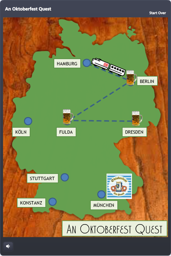
Timing: David put out the challenge only hours after I’d participated in the weekly #lrnchat discussion on Twitter. Everyone was terribly serious as they discussed how to work collaboratively in groups – until someone brought up beer as a motivational tool. Well, THAT got them dancing in the Twittery aisles, and the whole evening changed. I don’t drink much, but I made a large mental note of what got them engaged: The mere mention of beer.

Topic: As they say, go with what you know. After collecting entirely too many degrees in German, teaching German, and studying, working, and living in Germany – I thought to myself: “maaaaaybe something German…?”

Potential Game Features: I wanted to focus on designing a game board and some sort of progress meter. Since a map of Germany seemed like a natural game board, and a giant Maßkrug slowly filling with beer seemed like an outstanding progress meter, I decided to try those.

Design

Since my primary elements, the map of Germany and the Maßkrug, were better suited to a portrait orientation, I flipped the standard Storyline layout so they could inhabit the full screen.

Once I decided to use the game to teach German dining customs, I put a wooden background underneath the map to evoke the feel of a restaurant table, and the checkered tablecloth behind the Maßkrug for the same reason.

I also knew that sound effects would be critical, especially for filling the Maßkrug. I got lucky and found some evocative ones.


Oktoberfest Quest Game Board

Game Progress

There are two measures of progress: linear progress on the map, and liquidy beer progress in the Maßkrug.

Linear Progress: I thought a little Krug at each completed stop on the map would be a good tracker, and moving by train would make it feel like you’re making game progress, and also evoke the sense of traveling through Germany.

At each stop I used a zoom region to zoom in tightly on the city, and then an immediate “Box Out” transition on the following question slide so that, together, it would feel a bit like you’re zooming from the macro map to the micro restaurant where our protagonist needs some help. 

Krug-O-MeterBeer Progress: Every time you answer a question correctly, the Maßkrug fills up a little more. By also using it to briefly recap the teaching point, it doubles as a bit of learning reinforcement.

And speaking of learning stuff, I chose to make it an all-or-nothing game. You’re required to answer each question correctly in order to go forward. One wrong answer and you’re back in Dresden waiting for the train.

I credit Michael Allen with this torture. I saw a banking example of his where you decide whether or not to approve a series of checks for payment. One wrong decision, and you’re back to check one. It ticks you off just enough that you get determined to beat the stupid thing, and while you’re at it, you learn the principles being taught.

The Big Finish

I won’t spoil it for you, but it’s kind of awesome.

Play It!

My Oktoberfest Quest game is here, but you should also check out the other creative, amazing, and beautiful game ideas posted by others in the comments section of David’s original post here.

Please Don't Let Me Be Martha Stewart

Please Don’t Let Me Be Martha Stewart

With one eye on project deadlines and flights this week, I trained the other on goofing off with Articulate’s E-Learning Heroes challenge to bring the Inc.com What Kind of Leader Are You? infographic to life by interpreting it as a branching scenario.

What kind of leader are you?Infographic

Approach

Since this is a personality assessment that briefly flirts with a teaching moment, I chose not to set up full-blown scenarios with characters to put each decision point in context. It would be fun; but it would also seem kind of silly to spend all that time illustrating such abstract concepts when the only world that matters here is the user’s internal one.

I decided the cleanest and most expeditious way to bring some life and abbreviated context to this interaction was through good use of color, text, animation, and simple images.

Color

Since the world is flat these days, I snagged some flat design colors from one of Damon Nofar’s SlideShare presentations.

I like to relaaaaaaax by...Where are you most likely to interact with employees?Backwards DirectionForwards DirectionText & Animation

I suppose Damon decided he could inspire me with text, too, which must be why he posted this presentation. (And I now see he posted another one about using typography a few hours ago where he lays out a number of principles I used in my piece – but I hadn’t seen that one.)

In the end, Swiss921 BT made me happy, so that’s my title font. I threw in some Helvetica in honor of Damon’s devotion to it; though I’m more of a Calibri fan. (So there’s some of that, too.)

I decided that pulling key words and making them stand out would be the easiest way to let the user quickly scan the decision point.

I also messed with the keywords so they’re more expressive – whether changing the word itself (using lots of extra “a”s in “relax”), changing the type layout (so “interact’s” letters get all inter-mingly), and so on. I also used animation. My favorite is when the word “direction” comes in backwards, then quickly realizes its mistake and comes in forwards. But that’s just me.

Simple Images

I originally envisioned hand-drawn white line drawings to soften and balance the strong font I’d chosen, and gave Microsoft clipart a quick search.

I started by looking for a mountain image to illustrate the idea of a challenge. When I found one in Microsoft Clipart Style #1306, and took a quick look to see if the rest of the style could work, I had my images.

I wanted to take out, or at least adjust, the colors, but given time constraints I just made a few alterations to specific images (like the clouds that float across the sky at the beginning) and left it at that.

Rudy GiulianiDevices & Navigation

This piece seemed to want to be a little app, so I had the iPad in mind as I designed it. Works just fine.

I kept navigation simple, since it’s really just a one-way path. I added a “Start Over” link in the player so the path could be restarted as many times as desired – so if you don’t want to be Rudy Giuliani, or even Martha Stewart, you have an “out”.

Audio

I would love to put in audio (sound effects, etc.), but no time. Maybe I’ll add some soon.

See the Result!

You can see this little guy (and find out what kind of leader you are) here.